Liquid Glass App Icons & Icon Composer: the 2026 Spec

Apple's app icon is no longer one flat image. Since iOS 26 it's a stack of layers that the system renders in Liquid Glass, assembled in a free Mac app called Icon Composer and shipped as a single .icon file that adapts across iPhone, iPad, Mac, and Apple Watch. iOS 27 then revised the rendering again, and that second round is where most guides are now out of date.
TL;DR. What's true in 2026:
- Design on a 1024 px canvas in layers: one background plus one or more foreground layers. watchOS uses 1088 px.
- Stop baking in effects. Drop shadows, bevels, rounded corners, painted-on gloss: the system applies all of that now.
- iOS 27 reduced translucency for legibility, and Apple says that change is not automatic. Each icon needs a look.
- The shimmer is gone. The gyroscopic highlight that shifted as you tilted the device was removed in the first iOS 27 beta.
- You can still ship a single 1024 PNG in an asset catalog. Icon Composer is how you get the layered treatment, not a requirement for shipping.
What is Icon Composer, and do you have to use it?
Icon Composer is Apple's free tool for assembling a layered app icon and exporting it as one .icon file. You import your artwork as separate layers, annotate each one with color and glass properties, preview it across platforms and appearance modes, and export a single resolution-independent file that Xcode consumes. It requires macOS Tahoe 26.4 or later.
You don't have to use it. A single 1024×1024 PNG in your asset catalog still builds and still ships, and Xcode generates the sizes it needs from that one image. What you give up is the layered treatment: without separate layers there's nothing for the system to refract, highlight, or separate in depth, so your icon renders as a flat image sitting inside the glass shape rather than participating in it.
That's the real decision. Icon Composer isn't a compliance checkbox, it's the difference between an icon that reacts to the material and one that just sits in it.
What changed for app icons in iOS 27?
Four things, and this is where most existing guides are a version behind. iOS 26 introduced Liquid Glass icons in September 2025; Apple revised the rendering at WWDC in June 2026 for iOS 27.
| Change | iOS 26 | iOS 27 |
|---|---|---|
| Glass structure | One thick uniform overlay across the icon | Glass built into the individual artwork layers |
| Translucency | Higher, with washed-out artwork at times | Reduced for legibility. Not applied automatically |
| Specular highlights | Manual placement | Automatic, choosing inside or outside based on layer and background color |
| Motion | Gyroscopic shimmer that shifted as you tilted the device | Removed entirely in the first iOS 27 beta |
| Refraction | Applied broadly | Selectively applied, for separation between layers |
The one to act on is translucency. Apple is explicit that the reduction is not automatic, so an icon that looked right under iOS 26 needs a fresh look rather than an assumption that the system handled it.
The rest is gentler than it sounds. Open an existing iOS 26 Icon Composer file in the current version and the updated rendering applies on its own, with no artwork changes and no recompile. The shimmer removal is a straight win: the effect was producing an optical illusion that made icons look slanted.
How many layers does a Liquid Glass icon need?
At minimum, a background layer and one foreground layer. Beyond that, more layers give the system more to work with, because the material effects apply per layer rather than to the icon as a whole.
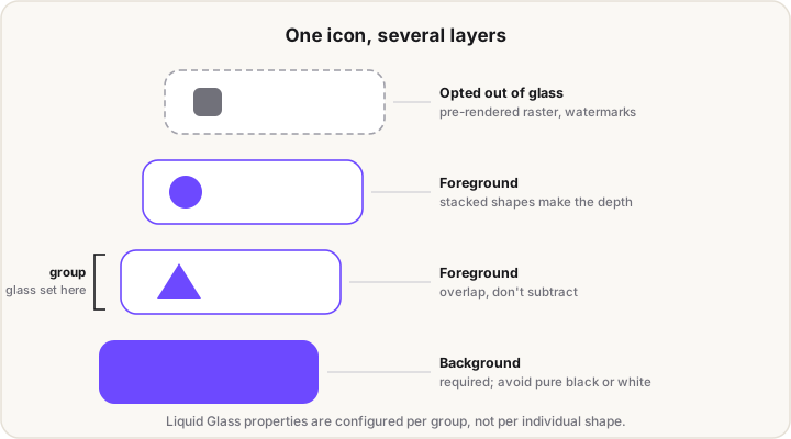
Layers render as glass by default when you import them, and you organize them into groups. Glass properties are configured at the group level, so a group is the unit you tune rather than each individual shape. Any layer can also opt out of the glass treatment entirely, which is the escape hatch for pre-rendered raster artwork or a flat watermark that shouldn't refract.
Two construction habits matter more than layer count:
- Use solid overlapping shapes instead of eraser paths. If you'd normally subtract one shape from another, expose both layers instead and let them physically overlap. The material needs real geometry to refract.
- Keep the shapes simple. Liquid Glass is sensitive to the number, size, and overlap of shapes, so small changes have outsized effects. Simplicity is what lets the icon hold up when it's rendered small.
What should you stop baking into your artwork?
Anything the material now provides. Apple's guidance is to pare back static effects in the source art, because a baked-in effect competes with the system treatment rather than adding to it.
- Drop shadows. The system applies a shadow per layer.
- Beveled edges. The material generates specular highlights.
- Rounded corners. The enclosure shape is applied for you, per platform.
- Any static glass or gloss. It fights the real thing.
A few design habits go with it. Reach for softer light-to-dark gradients instead of pure white or pure black. Flat, frontal perspective holds up better than a realistic 3D object. And thin strokes disappear at small sizes, so go bolder than feels necessary.
What are the appearance modes?
One icon has to work across default, dark, clear, and tinted presentations, and Apple renders all of them from the same source. Clear and tinted each come in light and dark variants.
The two worth understanding properly:
Clear mode. The icon's glass is pinned. It does not follow the system transparency slider, so it stays consistent and legible regardless of what the user has set. That removes an entire category of design problem: you're designing for one fixed glass appearance, not a moving target.
Tinted mode. The system applies a tint based on the user's preference, and you have no control over which color they pick. It might be a light yellow. So the icon has to hold its meaning through a form that reads without color, with real contrast built into the shapes rather than carried by hue.
Both are governed by a single grayscale mono annotation, which covers light and dark clear plus every tinted variant. Maximizing dynamic range there, with genuinely deep darks and bright highlights, is what keeps the icon legible across all of them. Keeping at least part of the foreground white or near-white is the reliable way to guarantee contrast.
There's a useful side effect: a high-contrast mono annotation enforces accessible design almost by accident, because an icon that survives being reduced to grayscale also works for someone with red-green color blindness.
How do you get artwork into Icon Composer?
Draw in a vector tool, export the layers, import, annotate. Apple publishes templates for Figma, Sketch, Illustrator, and Photoshop.
The two export rules that cause the most trouble if you miss them:
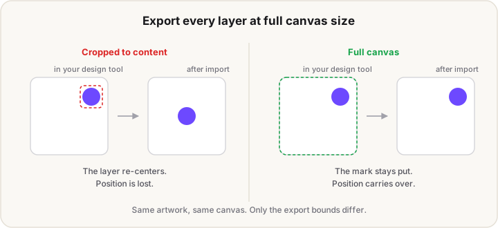
- Export each layer at full canvas size, not cropped to its own bounds. Positioning carries over from the canvas, so a cropped layer lands in the wrong place.
- Prefer scalable SVG over bitmaps. The
.iconfile is resolution-independent, and vector layers are what let one source render cleanly at every size on every platform.
In Xcode, the .icon file goes into your project alongside your Swift files as a normal resource, adjacent to the asset catalog rather than inside it. Confirm target membership, set the app icon name in the target editor to match the file, and remove the old asset-catalog icon so there's only one source.
Can you use an AI-generated icon with Icon Composer?
Partly, and it's worth being straight about where the line falls. An AI generator gives you a flat raster image. Icon Composer wants separate vector layers at full canvas size. Those aren't the same thing, and no amount of tooling closes that gap automatically.
What does work:
- As a background layer. A generated 1024 px image can sit at the back of the stack with vector foreground shapes drawn over it.
- As a layer that opts out of glass. Apple explicitly supports non-glass layers for pre-rendered raster artwork, so a flat image can be placed deliberately rather than fought with.
- As a design reference. Generate twenty directions in a few minutes, pick one, then redraw the chosen concept as clean vector layers. This is the honest workflow, and for most people it's the fastest route to a good icon.
What doesn't work is expecting real multi-layer refraction out of a flat image. A single raster is one layer, and the depth in a Liquid Glass icon comes from actual separated geometry.
Our own App Icon Generator sits on the classic side of this line, and deliberately so. It takes a 1024 px master and writes the traditional asset-catalog pack: AppIcon.appiconset with its Contents.json, the iOS 1024 PNG, the full macOS set, and every watchOS size. It does not produce a .icon file. If you're shipping the single-PNG path, or supporting older OS versions, that's the pack you want. If you're going layered, use it for the flattened marketing renders and build the layers in a vector tool.
The canvas, per platform
One design covers everything, but the canvas and enclosure differ.
| Platform | Canvas | Shape |
|---|---|---|
| iOS / iPadOS | 1024 px | Rounded rectangle |
| macOS | 1024 px | Rounded rectangle, canvas acts as a mask |
| watchOS | 1088 px | Circle |
| App Store | 1024 px | Rendered automatically from the same source |
The watchOS canvas deliberately overshoots the rounded-rectangle grid so the circular crop still works from a shared design. On macOS, legacy icons with unique silhouettes get their drop shadows stripped and are auto-scaled into the enclosure, which usually looks like a compromise. Apple's recommendation there is to redraw rather than let the system adapt an old shape.
For the full pixel matrix, including every legacy size the asset catalog still accepts, see the App Icon Size Chart.
FAQ
What is a .icon file?
It's the file Icon Composer exports: a single resolution-independent source containing your layers and their glass annotations, which the system renders per platform, size, and appearance mode. It replaces maintaining separate exported PNGs for each target.
Do I have to redesign my app icon for iOS 27?
Not structurally. Opening an existing Icon Composer file in the current version applies the updated rendering automatically, with no artwork change or recompile. The exception is translucency, which was reduced for legibility and is explicitly not automatic, so each icon deserves a look.
Can I still use a single 1024×1024 PNG?
Yes. An asset-catalog PNG still builds and ships, and Xcode generates the sizes from it. You lose the layered glass treatment, since the system has no separate layers to refract or highlight.
What size is the Icon Composer canvas?
1024×1024 px for iOS, iPadOS, macOS, and the App Store. watchOS uses 1088 px, which overshoots the rounded-rectangle grid so the circular crop still works from the same design.
Why did my icon stop shimmering?
Apple removed the gyroscopic specular effect in the first iOS 27 developer beta. It was creating an optical illusion that made icons appear slanted. Highlights still exist, at the top and bottom, but they're much subtler and no longer respond to device motion.
Does Icon Composer work on Windows?
No. It requires macOS Tahoe 26.4 or later. You can design the layers in any vector tool on any platform, but assembling and exporting the .icon file needs a Mac.
Working out which sizes to ship, rather than how the glass renders? The App Icon Size Chart has the copy-paste tables for every platform. Building for the web instead? The favicon sizes guide covers the browser set.