Android Themed Icons: What Auto-Theming Changed

Your Android app icon now gets themed whether you prepared for it or not. Since Android 16 QPR2, the system generates a monochrome version of any icon that doesn't ship one, using a color filter over your existing artwork. So the question stopped being "should I add a monochrome layer" and became "do I want to control how my icon looks tinted, or let an algorithm decide from artwork that was never designed to be flattened."
TL;DR:
- Themed icons have existed since Android 13. The system tints your
<monochrome>layer to match the user's wallpaper. - Android 16 QPR2 added automatic theming for apps that don't provide that layer. Yours gets themed either way now.
- Adding it is one line in
res/mipmap-anydpi-v26/ic_launcher.xml, and it can point at a drawable you already have. - Design to a 66×66 dp safe zone inside the 108×108 dp canvas.
- Android 17 changed nothing here. The icon spec is stable this cycle.
What are Android themed icons?
Themed icons are launcher icons that take their color from the user's wallpaper instead of using your brand colors. The user turns them on in system settings, the launcher recolors every supporting icon to match the current Material You palette, and the home screen ends up looking like one coherent set rather than a grid of competing logos.
The system doesn't recolor your whole icon to do this. An adaptive icon has three layers, and only one of them is involved:
| Layer | What it's for | What the system does with it |
|---|---|---|
<background> | The backdrop, usually a solid color or simple shape | Masked to the device's icon shape |
<foreground> | Your actual mark | Masked to the same shape, sits above the background |
<monochrome> | A single-color version of your mark | Tinted from the user's wallpaper when themed icons are on |
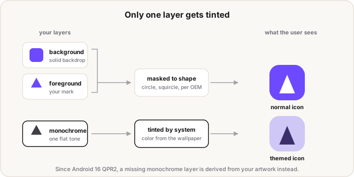
Themed icons arrived in Android 13, API level 33. For three years they were opt-in on the developer's side: ship the layer and your icon participates, skip it and your icon stayed full-color while everything around it went monochrome.
What changed in Android 16 QPR2?
The opt-out disappeared. Google's documentation now states it directly: Android 16 QPR2 and later apply automatic theming to apps without a monochrome layer. The system runs a color-filtering pass over your existing launcher icon, derives a monochrome version from it, and tints that.
Three things follow from this, and only one of them is obvious.
The obvious one: your icon appears themed on modern devices even if you've never touched an adaptive icon XML.
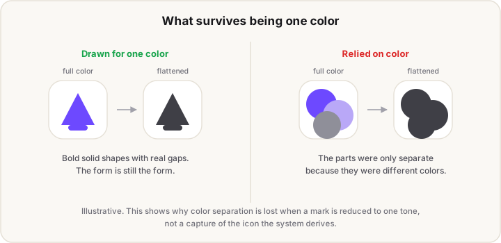
The less obvious one: you no longer control what that themed version looks like. A filter is deriving a single-color silhouette from artwork you designed to be seen in full color. If your mark relies on color to separate its parts, or on subtle tonal contrast between elements, that information is exactly what a flattening pass throws away.
The third: older devices still behave the old way. On anything before Android 16 QPR2, an app without a monochrome layer simply doesn't show a themed icon. So for the moment you're designing across both behaviors.
Do you still need a monochrome layer?
Yes, for two separate reasons.
Control. An auto-derived monochrome is a guess at what your logo means in one color. A drawn one is a decision. If your icon is a simple bold shape the filter will probably do fine, and if it's a detailed mark with fine strokes or tonal separation, it probably won't.
It's required if you want AEP qualification. Google's Apps Experience Program guideline requires a <monochrome> drawable in your adaptive icon XML, across every form factor your app ships on, with no exemptions listed. That page was last updated in June 2026, so it isn't a leftover from the original rollout.
The practical read: auto-theming is a floor, not a feature you were given. It stops your icon looking broken next to everyone else's. It doesn't make your icon look good.
How do you add a monochrome layer?
One element in your adaptive icon XML, at res/mipmap-anydpi-v26/ic_launcher.xml:
<?xml version="1.0" encoding="utf-8"?>
<adaptive-icon xmlns:android="http://schemas.android.com/apk/res/android">
    <background android:drawable="@drawable/ic_launcher_background" />
    <foreground android:drawable="@drawable/ic_launcher_foreground" />
    <monochrome android:drawable="@drawable/ic_launcher_foreground" />
</adaptive-icon>
Note the third line points at the same drawable as the foreground. That's legal, and it's the fastest way to ship something better than nothing: if your foreground is already a flat single-color shape on transparency, reusing it works.
It's not the best answer though. A mark that carries no color at all usually wants thicker strokes and less detail than the full-color version, and a separate drawable is where you make those decisions.
What should the monochrome artwork look like?
A solid silhouette on transparency, drawn to survive being one color. The system supplies the color, so anything you encode in hue is lost.
The measurements come from the adaptive icon spec, and they're the same ones the other layers use:
| Spec | Value |
|---|---|
| Canvas | 108×108 dp |
| Safe zone (never clipped) | 66×66 dp, centered |
| Reserved margin | 18 dp on each side |
| Logo size | 48×48 dp minimum, 66×66 dp maximum |
| Format | Vector preferred over bitmap |
That 18 dp margin on each side isn't only for the shape mask. The system also uses it for motion effects like parallax and pulsing, so content pushed into it can get cropped or moved in ways you didn't intend.
Four habits that matter more than the geometry:
- Go bolder than the color version. Thin strokes that read fine against a colored background disappear when the whole mark becomes one flat tone.
- Delete anything that only worked in color. If two shapes were distinguishable because one was blue and one was green, they merge. Redraw them with a gap or drop one.
- Fill the shape, don't outline it. Solid forms hold up at launcher size better than line art.
- Check it against a light and a dark tint. The tint follows the wallpaper, so your mark has to work as dark-on-light and light-on-dark.
Why does my themed icon look like a blob?
Almost always because the mark depended on color separation that flattening removed. Two shapes that were distinct as blue-on-green become one silhouette the moment they're the same tone.
Work through it in this order:
- Check whether you actually have a monochrome layer. If you don't, what you're looking at is the system's derived version, and the fix is to draw your own.
- Look at the mark in pure black on white before blaming the tint. If it's unreadable there, the tint isn't the problem.
- Check the safe zone. Content outside 66×66 dp can be clipped by a device's mask, and a clipped silhouette often reads as a shapeless blob.
- Thicken and simplify. Fewer, heavier shapes almost always survive better.
Did Android 17 change any of this?
No. Android 17 arrived in 2026 with Gemini Intelligence, desktop mode, app lock, the Handoff API, and an expanded Live Updates template. None of its announced changes touch the app icon spec.
That's worth stating plainly because the iOS side moved twice in the same window, and it's easy to assume Android did too. The adaptive icon geometry, the three-layer model, and the monochrome requirement are all as they were. If you did this work for Android 16, you don't have to redo it.
What our icon export does, and doesn't
Being straight about our own tool, since this article is about a gap that's easy to miss. Our free App Icon Generator writes the full Android set from a single master image: all five mipmap densities from mdpi through xxxhdpi, the 108 dp foregrounds scaled to each density, the adaptive icon XML, and the 512 px Play Store icon.
The adaptive icon XML it currently writes declares <background> and <foreground> only. It does not include a <monochrome> line. If you use our export as your starting point, that's the one thing to add by hand, and the snippet above is what to add. We'd rather tell you that than let you ship an icon that quietly falls back to the system's derived version.
FAQ
Is a monochrome icon required on Android?
For AEP qualification, yes: Google's guideline requires a <monochrome> layer in the adaptive icon XML with no exemptions. For simply shipping an app, no. But since Android 16 QPR2 the system derives one for you anyway, so the choice is whether you control it or not.
What size should the monochrome layer be?
The same 108×108 dp canvas as the other adaptive icon layers, with your mark inside the centered 66×66 dp safe zone. Keep the logo itself between 48 and 66 dp, and supply a vector rather than a bitmap where you can.
Can the monochrome layer be the same file as the foreground?
Yes, and it's a valid quick fix if your foreground is already a flat single-color shape on a transparent background. A dedicated drawable is better, because you can thicken strokes and drop detail that doesn't survive flattening.
Why isn't my themed icon showing at all?
Three reasons the system skips it: the user hasn't turned themed icons on, the launcher doesn't support them, or your app has no monochrome layer and the device predates Android 16 QPR2. On newer devices the third case now produces an auto-derived icon instead of nothing.
Do themed icons affect my Play Store listing icon?
No. Theming applies to the launcher icon on the device. Your 512 px Play Store icon is a separate asset and is never tinted.
Need the density chart and every Android pixel size rather than the theming rules? The App Icon Size Chart has the full tables, including the adaptive icon safe-zone diagram. Shipping on iOS too? Liquid Glass app icons covers Apple's version of the same idea.